I also have two front cover designs and really don't know which one to use. A few people said the bottom one is too similar to Anorak.
Thursday, 28 April 2011
Owl magazine Final edit
So here is the latest version of my magazine I have uploaded to Issuu.com. This will probably be the last time a draft gets posted on here as I will be taking it to get printed next week! So the next one up will be the final version. Any comments on how to improve it would be fab!
Sunday, 3 April 2011
Magazine in progress
I have uploaded my magazine to Issuu.com so you can see how it might look when it is finished.
Wednesday, 30 March 2011
New Logo and Merchandise Ideas
I have come up with a new logo for my magazine, I went off Pelican, and have renamed it Owl magazine instead. I prefer the look of this logo and it also means I can change the colour of it depending where it is used. As well as the mag I am making a few bits of merchandise. These will mainly be used for the degree show, but I am planning on making one of each item by the time I hand in. The apron is going to be screen printed with the owl picture and the notepads will either be screen printed or I will get stickers made with the logo. They are just designs at the moment, but when I get proper ones made I will post up the photos. There will also be more page layouts to come shortly.
Monday, 28 March 2011
Edited Page Layouts
I had a very helpful tutorial last week, lots of constructive criticism which is good I think. I have a lot to do to make my pages better and they have changed quite a bit since the last post. The main feedback I got was:
The borders aren't necessary, use of colourisation needs to be better (ie. I had lots of clashing colours!), make more use of white space, find fresh fonts, move some of the page titles around to mix it up a bit. It is amazing what another pair of eyes can tell you!
Other suggestions included: Making the owl smaller on the bird wordsearch page, giving the child more space to draw. Using the butterflies and caterpillars across a double page, and using the green panel with butterflies on, on a separate page.
I have also changed the page size so it isn't A4 as I thought it would make it more bespoke.
And after taking all the advice on board, here is what I have come up with . . .
Monday, 21 March 2011
More Pages
Here are some more pages that I spent last week working on, I think I am nearly half way so getting there!
Monday, 14 March 2011
Update....
So I think it is time for another update on my magazine, here are some page layouts I have been working on. Making a magazine is a lot more challenging than I thought but I think I am beginning to get the hang of it! They are all double page spreads, and I have taken some of the advice on board from my last tutorial (to fill in sections of the fish picture with black). These aren't finished but I hope I am close as there are a lot more pages to go!!
Friday, 4 March 2011
Caterpillars and Butterflies
Here is a fun little puzzle I have made for my magazine. You have to count them to see if there are more caterpillars or butterflies.
Wednesday, 2 March 2011
Examples of Page Layouts
This is an example of what one of the double pages might look like. I have done one with the pelican flying across the page, and another with just the simple page numbers. However, after all that drawing I have a horrible feeling it looks better with the standard page numbers! I am going to play about with it a lot more before I decide on what to do.
More Pelicans!
To make my magazine more fun I am using my Pelican as a character who will appear on every page, working as an indication of where in the magazine you are. For example on the first page, the pelican will be standing on a post. On the second page he will be taking off, and on the third he will flying etc etc. The images will be quite small on the page, so I hope these will work in that context. My plan is to put the page numbers on the tree stumps.
Tuesday, 1 March 2011
Pelican Logo Ideas
These are the ideas I have come up with for my logo design, which will be used on the front cover of the magazine and merchandise etc. I have kept the colours simple so that it will fit in with most colour schemes and I have included one on a blue background to show this. I am having trouble deciding which one is my favourite, but I think I am swaying towards the one with the stripy L. Any suggestions?
Monday, 28 February 2011
Magazine Name Ideas
Ok so my first idea for a name was Toucan, I liked the idea of the tropical colourful bird, thought I could make it into quite a fun character. These are the initial design ideas I showed in the seminar today. However, what I didn't realise was that Toucan is already associated with Guinness! So the search for a new name is on. These are my ideas. Please leave a comment if you have any ideas or if you think any of these are good.
Pelican
Bud
Moose
Zebra
Kingfisher
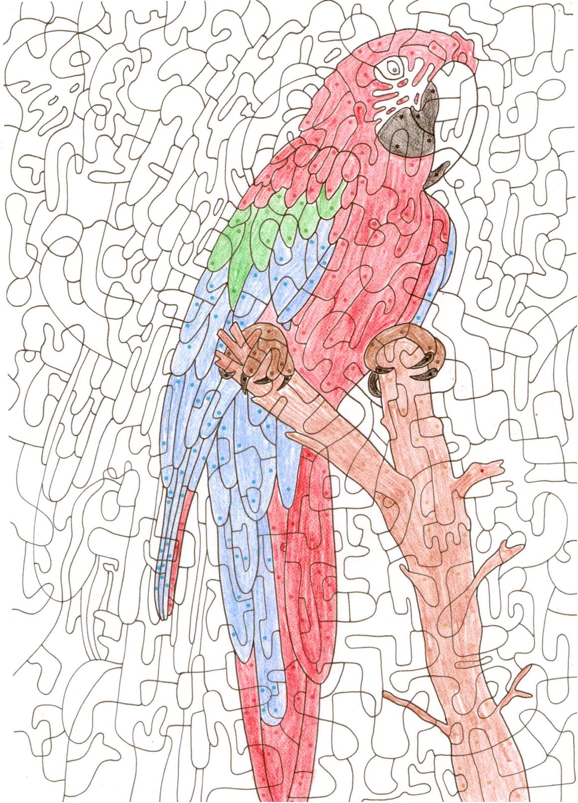
Reveal the hidden picture
For this activity, you have to colour in the sections represented by the different coloured dots. When they are coloured in, it will reveal a picture!
Fishy Picture
Originally this picture was going to be a landscape with a wordsearch in the shipwreck. However, after the seminar today, everyone agreed that it works better using the negative space and adding the wordsearch would make it too cluttered. So... taking the feedback on board I am going to use it as a colouring page instead, and will maybe do the wordsearch on a separate page.
More Sketchbook Pages for my magazine
Well, since the critique last week I have been busy doing lots of idea generating and drawing! Here are the lastest sketchbook pages with my ideas, more work to follow!
What Alice Found
We got an email at Uni about a competition to design the logo for a new shop in Bournemouth called 'What Alice Found'. If it wins it would get used on the shop front, as well as on labels etc. I used old music paper to create the lettering, adding watercolour, collage, pen and digital colour in Photoshop. I used the teapot and teacup to represent the Mad Hatters tea party. I'm sure there will be plenty of entries, but it was fun to have a go.
Friday, 18 February 2011
Illustrations and Making Projects
These are the illustrations and page layouts I have been working on since doing the roughs in my sketchbook. There are only a few at the moment but now that I have most of my ideas it will be easier to start doing them. The peacock will probably be a colouring page, there is going to be a page on crocodiles (how to make a cucumber crocodile), and I am creating a page on how to make Panda Cupcakes. I am really enjoying this project so far, it is great to make and draw things I am so interested in.
Sketchbook Pages So Far
These are the pages from my sketchbook so far; most of them are ideas at the moment as I like to plan out all my illustrations before I start them.
Subscribe to:
Posts (Atom)